Category /
mobile app
Remember building forts as a kid out of anything you could find, like blankets, chairs, and sticks? Those days are gone. Today's kids have the luxury of play couches - modular foam structures that can be transformed into forts, slides, or obstacle courses all at once. Couch Play is an application designed for play couch owners that offers ideas for various builds.
Project Summary
Background
Play couches for kids are essentially sets of foam blocks in various shapes, accompanied by slipcovers. These blocks are stackable and sturdy, providing hours of entertainment for children. Recently, they have become a phenomenon in the world of parenting, despite their relatively high price tag.
The Challenge
Play couch owners are not finding enough build ideas that they can use because existing resources don’t account for user preferences and the pieces users own. If we can solve this problem, it would allow play couch owners to save time because they won’t need to browse through many irrelevant ideas.
My Design Process
click a section to scroll ahead
RESEARCH
I began this project with the following hypothesis that I aimed to validate through research:
Hypothesis
Play couch owners are looking for a centralized place for play couch inspiration where they can both look up and share their build ideas.
I needed to understand what are the biggest pain points for play couch owners post-purchase. First, I established that there was no app on a market that offers play couch builds ideas. To begin, I conducted a competitor analysis, examining indirect competitors that parents typically use for inspiration, such as Facebook groups, Pinterest boards, Instagram accounts, and even Etsy sellers.
Key takeaway from the competitors' analysis:
All current sources of inspiration share one common disadvantage: they do not take into account the pieces that a user currently has, resulting in many irrelevant builds.
To dig deeper into this pain point, I needed to connect with users, so I ran a survey and conducted 1:1 user interviews.
Research Insights
A survey was filled by 90 play couch owning parents, while 3 parents participated in 1:1 interviews.
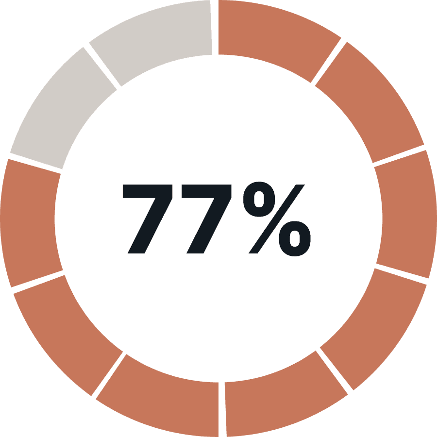
users mentioned that coming up with new build ideas was difficult
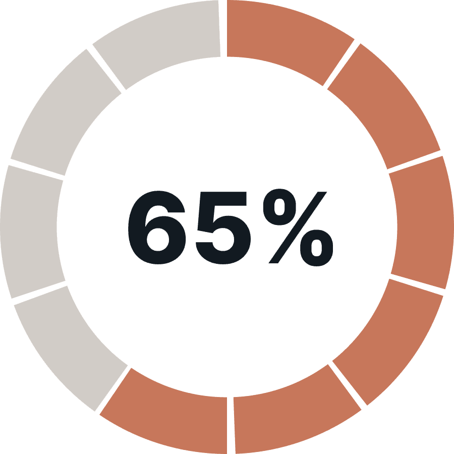
users save build ideas for later use, either as screenshots or a “saved post”
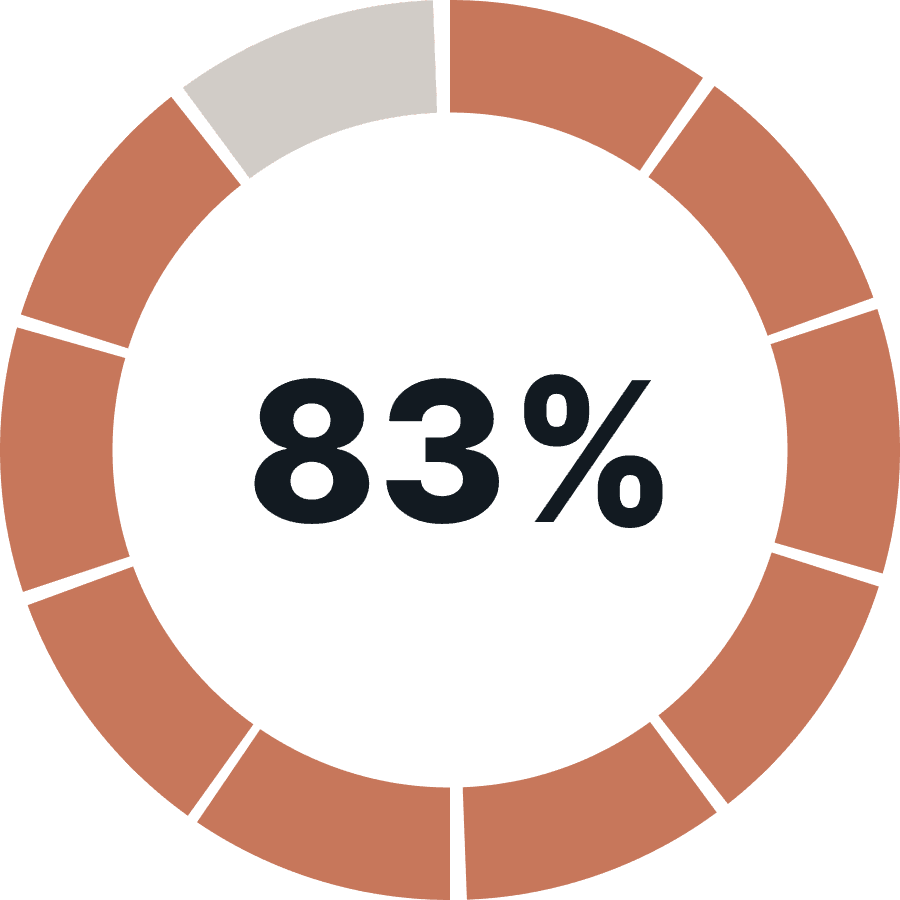
use social media to find inspiration (Facebook and Instagram are the top choices)
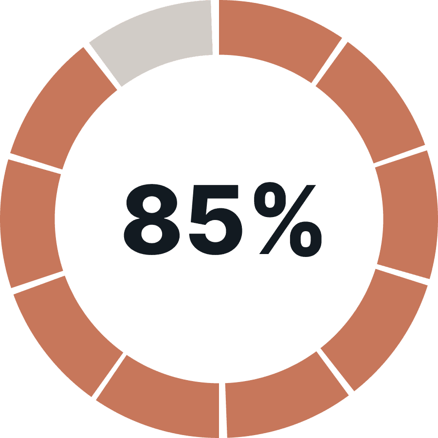
users mentioned that they do not want to share their builds online, primarily because of privacy reasons
Build ideas online are majorly irrelevant because they involve using pieces that a user does not own.
There is no single place to check for inspiration.
Searching for a build is a time-consuming process, which is especially painful if you have an impatient toddler by your side.
I went beyond just numbers and listened to user stories to truly empathize with their needs and desires.

Someone needs to build an app where you can input which Joey [a play couch] pieces you have and it will show you all the builds you can make.

I need step-by-step instructions because I'm a visual learner and I need to see how someone puts it together, not just the end product.

They have this for LEGO now. Take a picture of your assorted lego bin and it gives you instructions using the pieces you have. Amazing. Totally need this for my play couch too.
These findings challenged my assumption that users would be interested in a 'social media' platform for play couches, where they could share and discover build ideas.
DEFINE
Research Synthesis
To synthesize my research findings I jumped into an affinity mapping exercise to further understand user’s pain points. Four main user needs emerged from the research.
New build ideas
Find ideas relevant to what they already own
Find ideas relevant to what their kids like
Save build ideas for later
From here I was able to deliver a Point of View for my user:
Play couch owners need a way to find more build ideas relevant to them because they have limited resources and want to get the most out of their play investment.
This led to an actionable How Might We statement that guided all the consequent work:
How might we help play couch owners maximize the number of builds they can create with the pieces they already own.
User Persona
Through the research I was able to identify a user persona for the future app. I kept Sarah in mind for the rest of my design process.
Feature Roadmap
Next up, I evaluated all the ideas that I had generated or received from users, using a scale that measures the level of effort required against the potential impact. Based on this assessment, I created the following grid.
Must Do Features:
Ask a user to enter pieces they already own
Offer users a questionnaire to better define their preferences
Show a user a filtered list of builds based on their preferences
Allow user to search for builds
Filter builds by categories for faster searching: forts, slides, pretend play etc
Provide a description for a build
User Flow
Before going into UI design, I took the time to carefully map out the various user flows so I could design for all scenarios. However, I quickly realized that I am getting lost in edge cases. For the MVP I decided to focus on two primary user flows: Onboarding, which involves taking a quiz, and Finding a Build.
INTERACTION DESIGN
Sketches
Drawing my ideas on paper was an excellent way to plan out the user experience and present it to others. Both of my flows, Onboarding and Finding a Build, were simple and uncomplicated, which is a positive starting point.
Mid-fidelity wireframes
With my initial ideas mapped out, it was time to put them in mid-fidelity prototypes to test the overall skeleton of an app. Through various iterations I landed on these mid-fi wireframes.
Pivots
I believe that asking for feedback early and often is crucial in the design process. Therefore, I ran a quick test with one user to get their opinion on the flows. Two issues were flagged:
the term "play couch" can have different meanings for different individuals. To avoid confusion, I decided to specify which pieces are being referred to instead of simply using the term "play couch".
Before
It’s unclear what pieces are included in a play couch, because different brands have different setup
After
We’ve split a basic play couch into pieces to allow users to select exactly what they own
my initial idea to allow users create custom collections within their Favorites was met with a neutral response from a user. Since this feature is quite complex, I've decided to put it on hold for now and instead gather feedback from users during usability testing to learn how they prefer to manage their Favorites.
Before
An ability to create custom collections for Favorite builds creates more frictions than provide benefits
After
Stick to a very basic functionality of adding a build to Favorites and showing a simple feedback
UI DESIGN
As I was building this app from scratch, I needed to develop its branding. Although the app revolves around a child's toy, its primary user demographic consists of adults. This presented a challenge in creating a playful yet aesthetically pleasing look and feel. Knowing that images of the builds would be vibrant and colorful, I opted for a subdued pastel color scheme for the app's user interface to balance it out.
Mood Board
I took the time to gather reference to guide my UI decisions in a mood board
Brand
The name "Couch Play" is a reversed version of the toy name "play couch," which effectively communicates the purpose of the app. The logo features a tent, which is one of the most recognizable play couch structures.
UI Kit
As this is an iOS app, I opted to use the standard iOS typography and system colors. iOS typically favors toggles over checkboxes and radio buttons, but for the purposes of creating the best user experience for a quiz, I decided to stick with checkboxes and radio buttons.
It was difficult to find suitable images of play couches, especially since I wanted hand-drawn images to give a playful feel to the app. To solve this problem, I drew the images myself by using a few templates sourced from the internet.
ITERATIONS
Usability Testing
The biggest challenge for usability testing was finding testers from the relatively niche target audience. To address this, I tried two different approaches: moderated testing and unmoderated online testing via Maze.
Unmoderated testing
Participants: 43
Participant screener: play couch owner, parent/guardian
Platform: Maze.co
Moderated testing
Participants: 4
Participant screener: play couch owner, parent/guardian
Platform: Google Hangouts
While unmoderated testing allowed me to recruit a high number of participants, the results proved difficult to use for two reasons:
my audience was unfamiliar with the concept of prototypes and required additional guidance when using them
the app is highly customizable in nature, and without users inputting real data, it was difficult to fully understand the app's usefulness for them.
Nonetheless, unmoderated testing did prove useful in evaluating the login/sign up experience, where many users experienced a hiccup.
Iterations
Both moderated and unmoderated testing led to the following iterations in the app.
"Continue as guest" issue
Choosing to "Continue as a guest" is the least optimal way to experience the app as it doesn't encourage users to take the quiz and enter their preferences. Therefore, I have decided to eliminate the "Continue as a guest" option entirely.
Before
One screen for all three flows: login, sign up and
a guest flow.
After
Login defaults to Face ID/Touch ID. Failed Face ID and new users are forwarded to a directional screen. No guest experience.
Quiz images are misleading
Users are confused by the images in the quiz. When the image shows two pieces of the item, they wondered if choosing “1” mean one piece or one pair? To avoid the confusion, I sourced images of a single item for all the pieces.
Before
Pieces that are usually sold in pairs, are pictured in pairs, too.
After
All pieces are pictured in singular to avoid misunderstanding.
Search bar is underused
Much to my surprise, users did not show much interest in using the search bar throughout the app. This was mainly because they reported not being sure what exactly to search for. In order to save time and resources, I decided to remove the search bar from all screens except for the home page. Instead, I invested in a good filter feature as an alternative.
Before
A search bar appeared on every screen but got very little interest from users
After
A filter on a Category page allows users to filter down by pieces included in a build.
FINAL DESIGNS
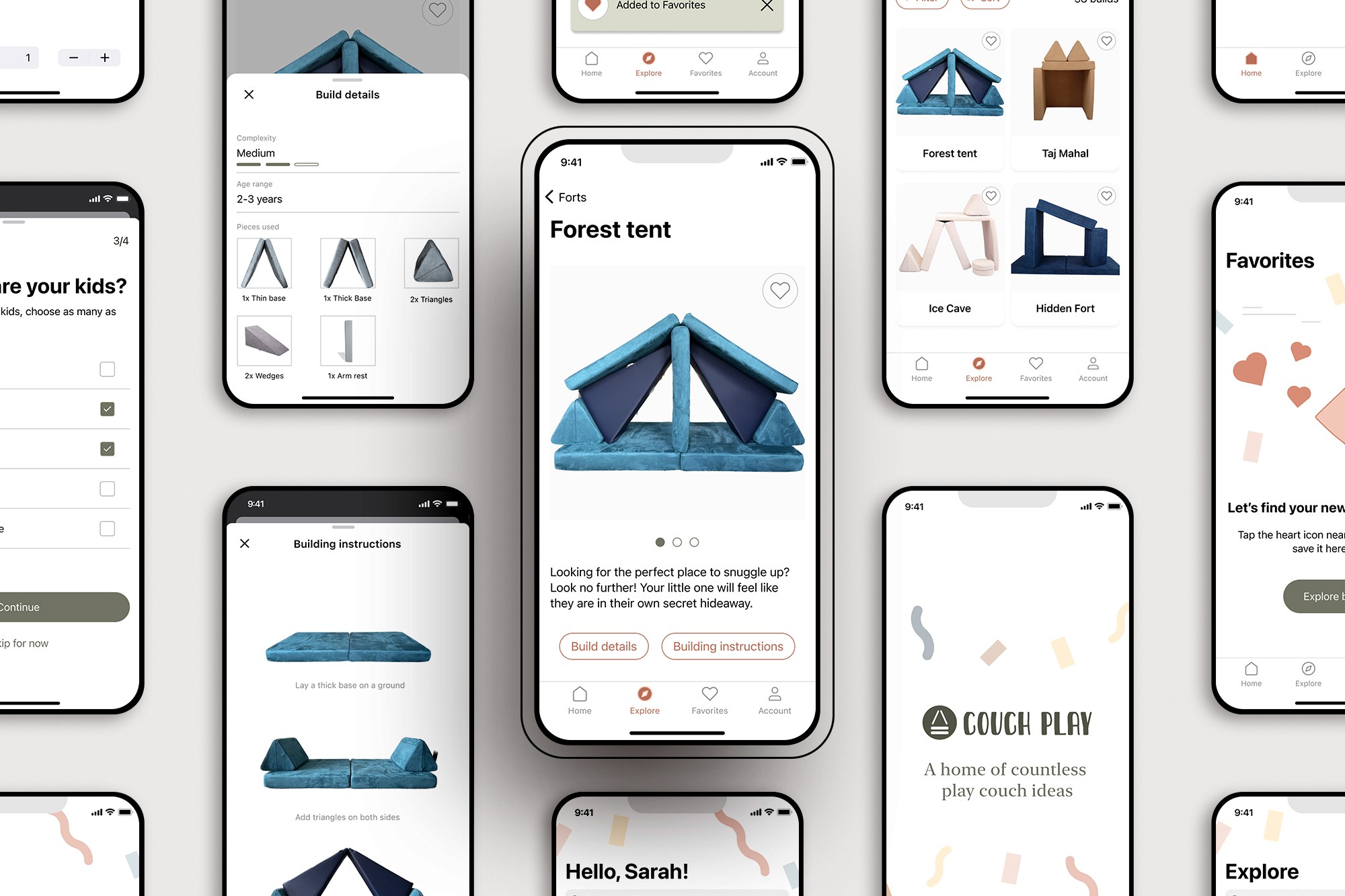
LEARNINGS AND THE NEXT STEPS
Learnings
Working with a niche group of users can be very challenging, particularly if the team cannot directly access users to conduct research and testing.
To find users in a niche market, searching online communities such as Facebook groups, Reddit threads, and forums can be an excellent option.
Unsupervised testing does not work well for apps that require user input at the beginning. In my case, many users abandoned testing because the prototype only supported certain quiz answers and did not allow for entering their custom data.
An unexpected insight was that many parents are not comfortable sharing pictures that include their children or parts of their homes online. As a result, the perspective of the app shifted away from being a "social media" platform for play couches.
Next steps
Given additional time, I would like to expand the filter feature in the app. Our testing has revealed that users rely heavily on the filter to sort through builds based on age range, complexity, and size.
Users have expressed concern regarding screen time and do not want to expose their children to an app solely for building structures. Instead, they request an option that can be used offline. As a solution, I would like to investigate the possibility of allowing users to share and print builds for an offline experience.
In the long term, this app may consider partnering with play couch brands to incorporate an e-commerce component into the app. This would serve as an additional sales channel for businesses, while still remaining a free exploratory tool for parents.
my other work


