Category /
responsive website
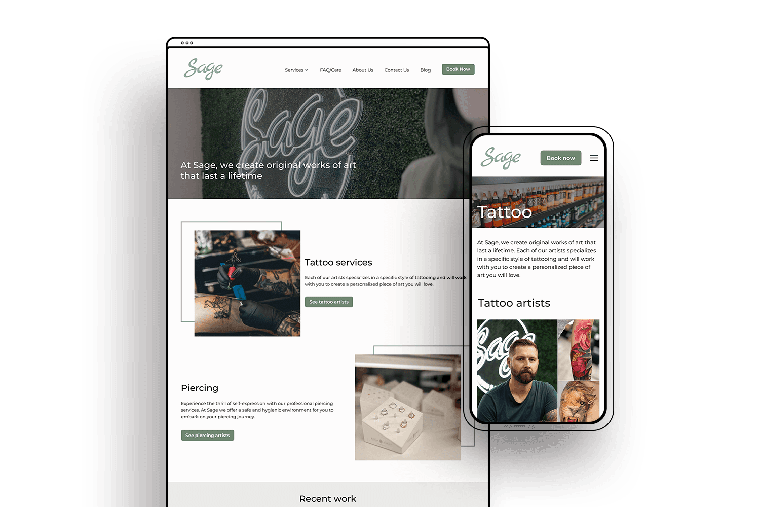
Sage Tattoo is among the biggest tattoo studios in the National Capital Region in Canada, with more than a dozen artists currently employed. Despite the studio's considerable size, the operational side of the business is overseen by only 3 people. They struggle with keeping a website up-to-date, managing all the inquiries, and handling bookings. In collaboration, we embarked on a website redesign that reflects their core values, enhances user-friendliness, and simplifies maintenance.
Project Summary
Background
Sage Studio provides clients with two primary services: tattoos and piercings. With only 3 team members running the business, website updates frequently fall by the wayside. As a result, it's often out-of-date and generates fewer leads. The business is seeking to automate the booking processes and better showcase its value proposition to attract new clients.
The Challenge
While Sage is primarily renowned for its tattoo services, they wanted to highlight their piercing offering better, as it’s one of their largest revenue makers. They want to emphasize their tattoo and piercing artists, tell more stories, showcase the work, and tell about their values. At the same time, the website needs to be optimized for efficient booking, all while being easy to maintain.
My Design Process
click a section to scroll ahead
EMPATHIZE
As someone who does not have any tattoos, I felt compelled to extensively study tattoo salons and the user experience they offer. Unfortunately, the client did not have their website analytics readily available. Thus, I had to employ several avenues of research to empathize with the user. I undertook three forms of research: competitive analysis, user surveys, and user interviews.
Where we start
Before jumping on a research, I wanted to carefully examine the existing Sage website and set the re-design objectives with the client.
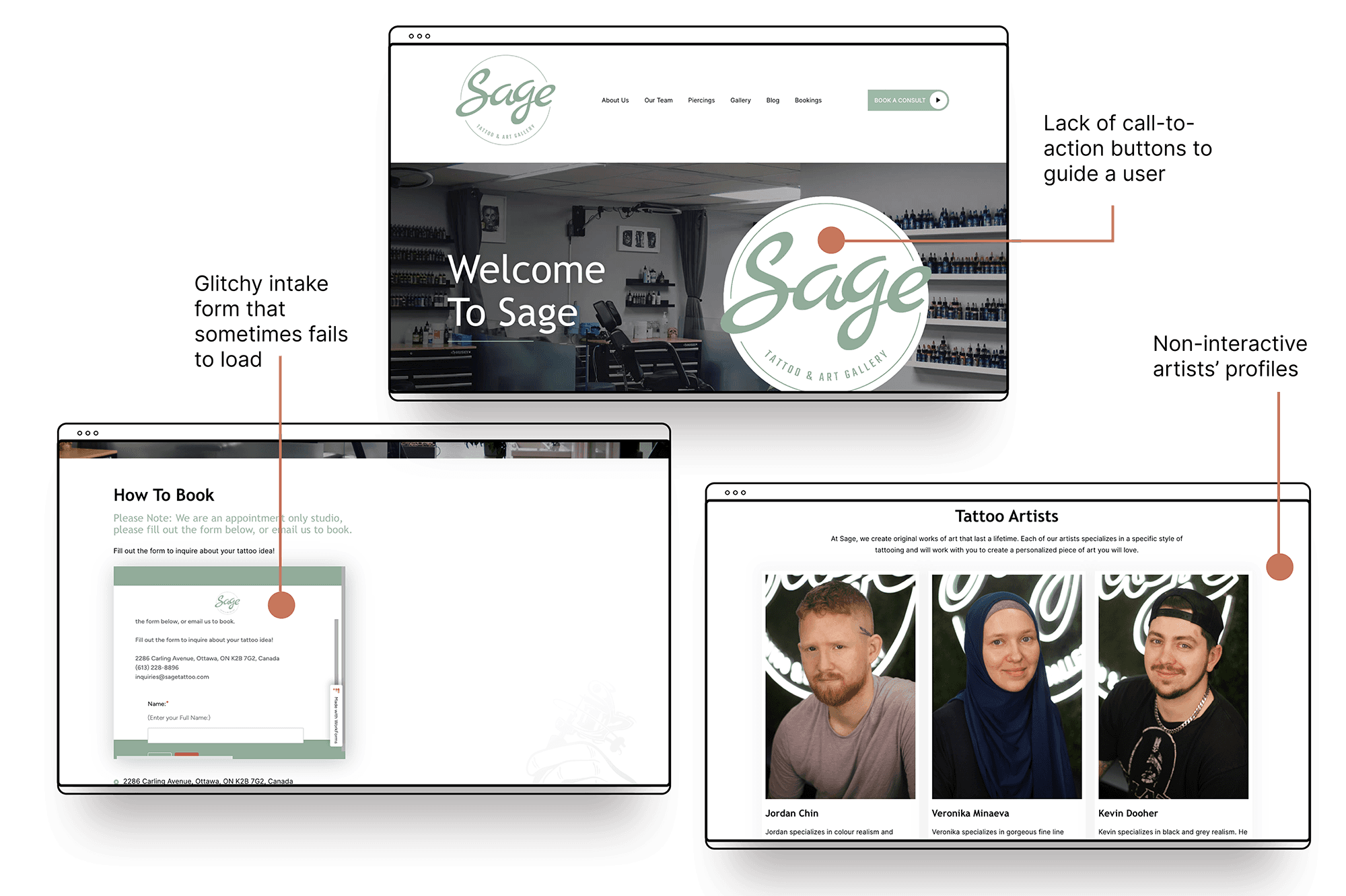
Sage Tattoo's original website
After conducting a heuristic analysis and engaging in a few rounds of conversation with the client, we arrived at the following objectives.
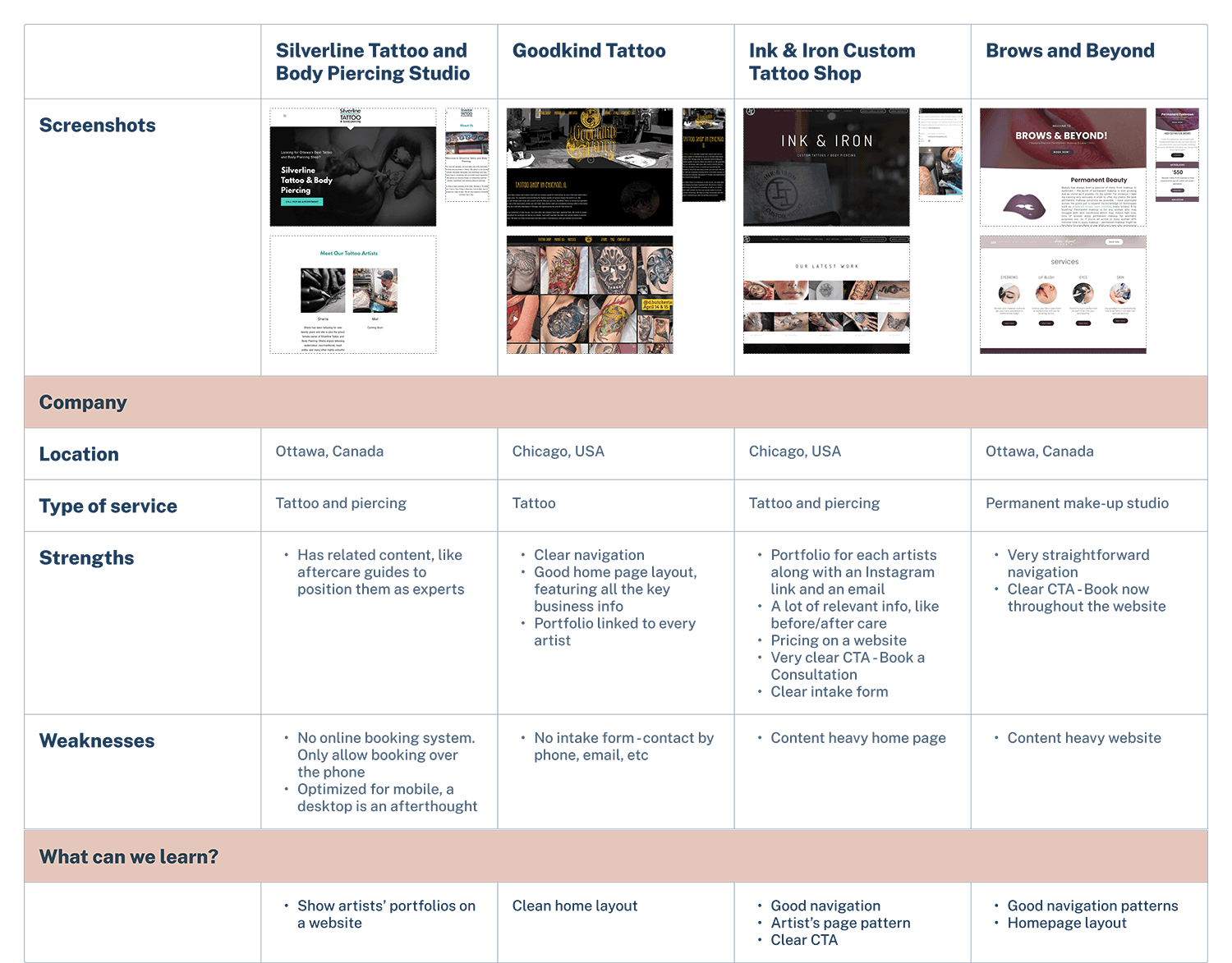
Competitive analysis
For the competitive analysis, I looked at a several types of businesses:
a top ranking shop in the same area as a client (Ottawa, ON, Canada)
indirect competitors in the area, like permanent make-up salons
top-ranking tattoo shops in Google
Key takeaway from the competitors analysis:
Many tattoo studios tend to opt for a dark and intense colour scheme for their websites. However, Sage stands out with their current use of a white and green colour palette and we should keep this. What we can learn from the competitors, however, is the clear navigation patterns and an emphasis on tattoo and piercing artists.
Research Insights
Google Trends
Sage had a limited understanding of their target audience because they didn't keep track of their analytics. To help them understand their users, I turned to Google Trends. Using this tool, I identified what people are searching for and determined the demographics of the audience. Although the target audience for tattoo salons is diverse the typical demographics of customers tend to include:
AGE
Typically between 18 and 40 y.o., although there are also older and younger individuals who get tattoos.
GENDER
Both men and women, so we should cater to both audiences.
EDUCATION AND INCOME
Tattoos can still be seen as a luxury or discretionary expense. Therefore, customers may have higher levels of education and income.
User survey and interviews
To gain a better understanding of Sage's clients and their needs and concerns, I conducted user surveys and 4 interviews. One of the biggest takeaways I had after speaking with users is:
You're going to live with the healed work, not the fresh work.
- Nana, 35
Being able to see the outcome of the tattoo - ideally over a long period of time - is what eases any fears or anxiety.
- Rebecca, 34
Tedious booking process. Oftentimes artists require clients to contact them on Instagram and go through many back and forths.
Users feel unprepared for the first visit. They need better communication about what to bring and how to prepare.
Users want to get to know the artist before booking. They expect a short personal bio on a website to get to know the artist.
Information about sterilization procedure often isn't readily available
To my surprise, only 33% of users considered website aesthetics to be of high importance. However, 95% of users stated that they wouldn't book without first seeing an artist's portfolio. Based on user feedback, I concluded that the website must include several crucial components:
An artist's portfolio
Pictures of healed work
Links to artists' social media
A convenient booking form both for my client and their customers
DEFINE
Research Synthesis
Now that we've learned from user interviews, it was time to put those insights into action and see how we can implement them on a website. To begin, I conducted an Affinity Mapping exercise to determine what problem statement we could derive from it.
to get to know the artist
to see the portfolio
to feel less confused as a first-timer
to see healed pictures
to ensure it's safe
a well described booking process
By analyzing the most common frustrations, I landed on the following problem statement for Sage Tattoo:
Problem statement
Our tattoo and piercing clients lack confidence when selecting an artist to work with because they don’t have enough info to make the right decision for them.
I realized that first-time customers need to feel assured that they are making the right choice when selecting both the artist and the salon because this would alleviate any fears they may have.
So How Might We…
help first-time customer boost their confidence when deciding to book a tattoo appointment?
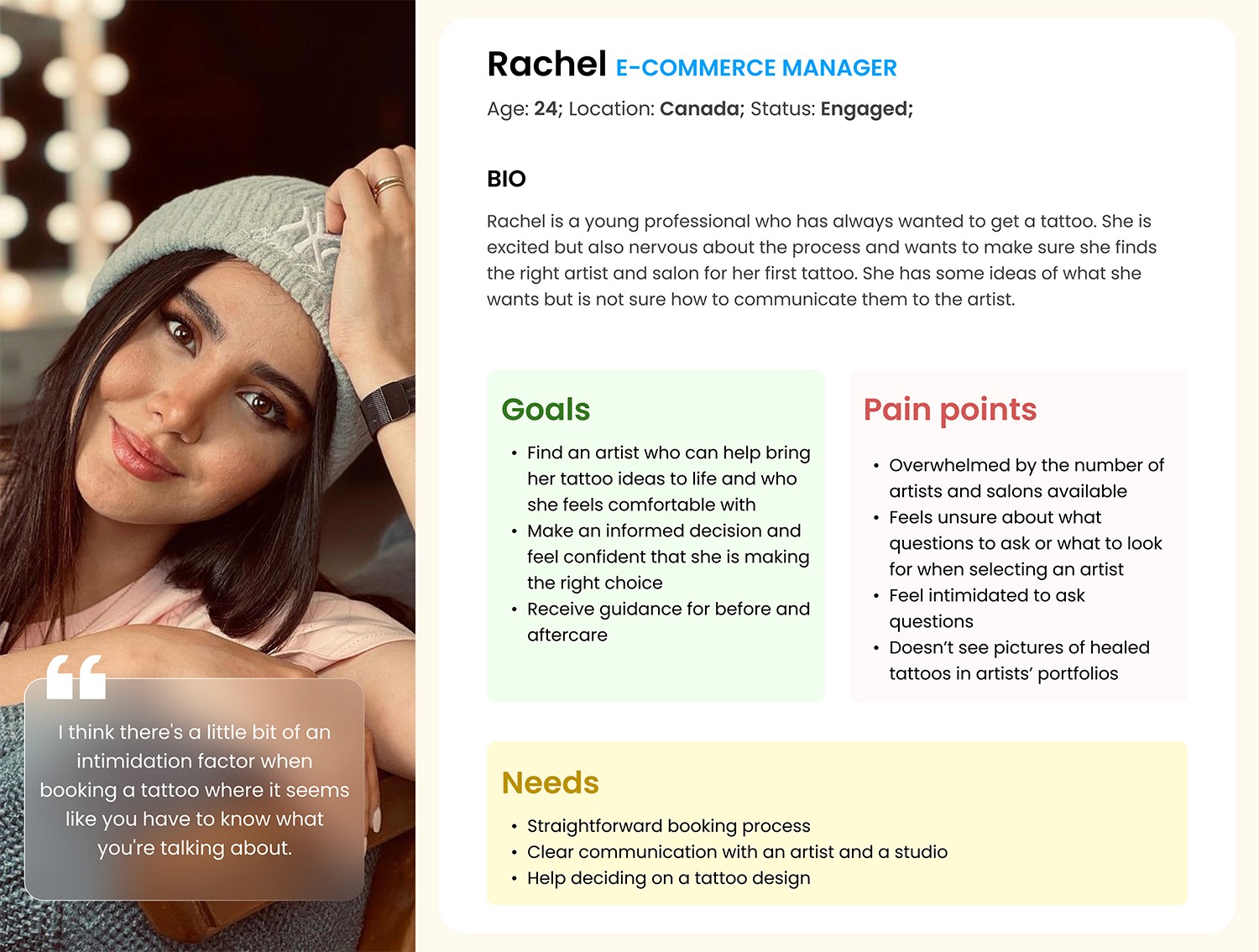
User Persona
To effectively communicate a problem to a client, I created a user persona to give a human face to a problem I discovered.
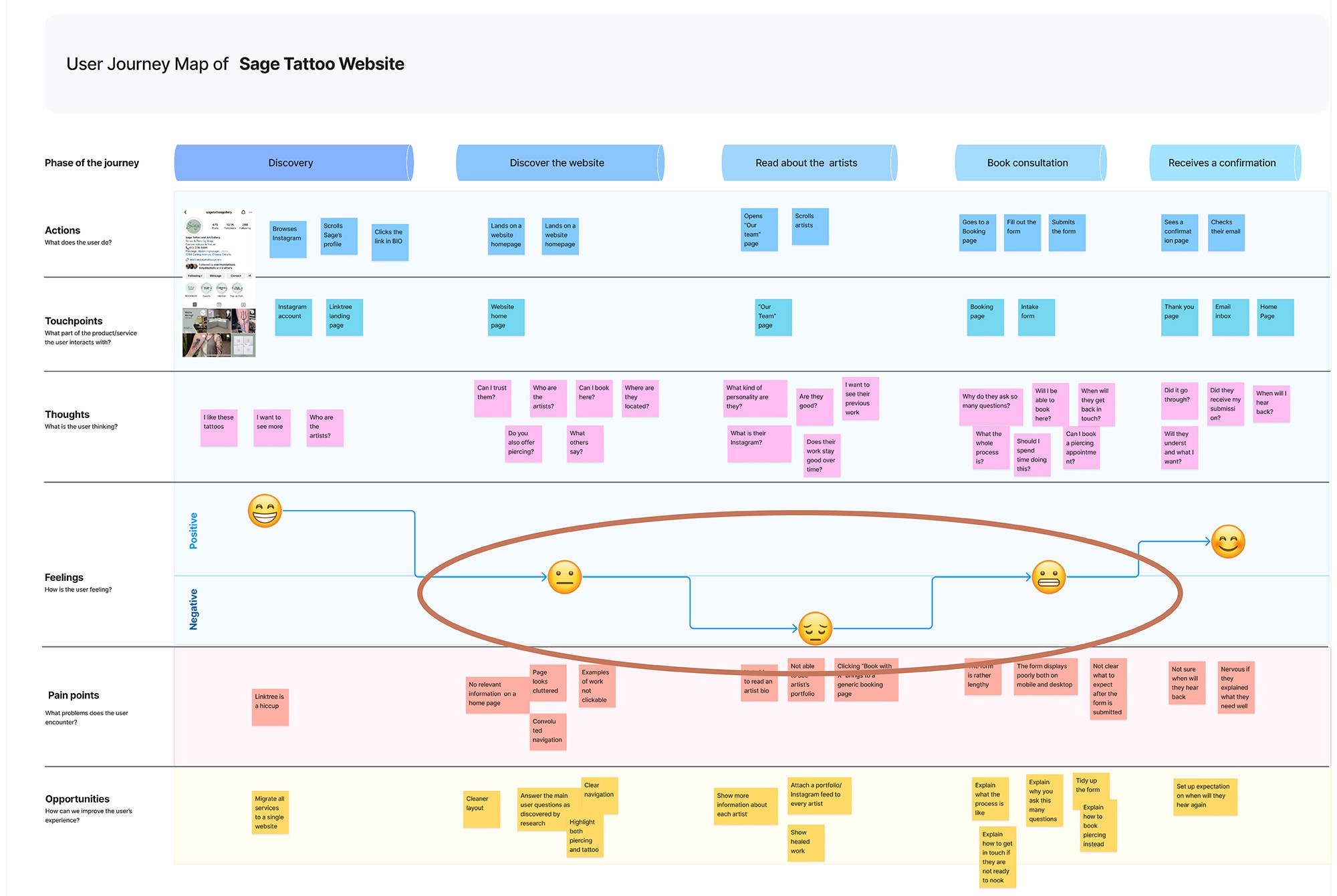
User Journey
I realized that having a persona wasn't enough for me to provide a client with a complete understanding of the problematic areas on their website. I needed a tool to show them exactly what frustrates users like Rachel while they interact with the site. User Journey was the perfect solution for this.
Wherever the user experience (indicated by an emoji) falls below the neutral line, improvements are needed. Therefore, I have defined two task flows that this project focuses on:
Find and read about the artist
Book a consultation
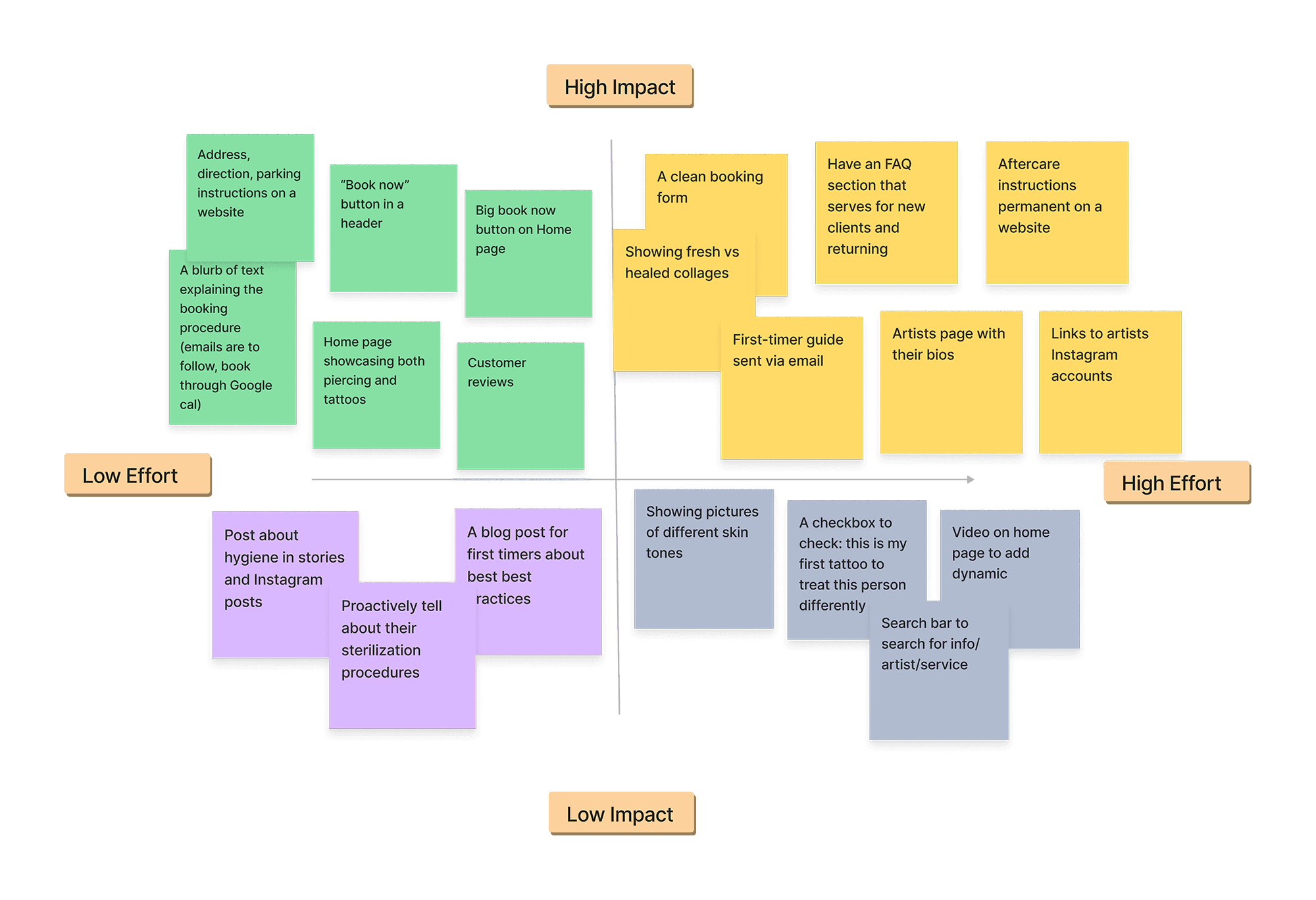
Feature Prioritization
Due to the project's limited timeframe of only 5 weeks, I had to prioritize which features to include in the new version of the website. I categorized my brainstorming ideas using the impact vs. effort scale to determine which features would provide the maximum impact with the minimum amount of effort.
Ultimately I ended up with the following list of features for Sage’s new website.
Must-Have Features:
An easily discoverable "Book Now" button that leads to an intake form.
A clear description of the booking process on the booking page, including information about the back-and-forth communication required between the user and the studio.
A separate "Contact Us" page that includes the studio's address, a map, and a contact form.
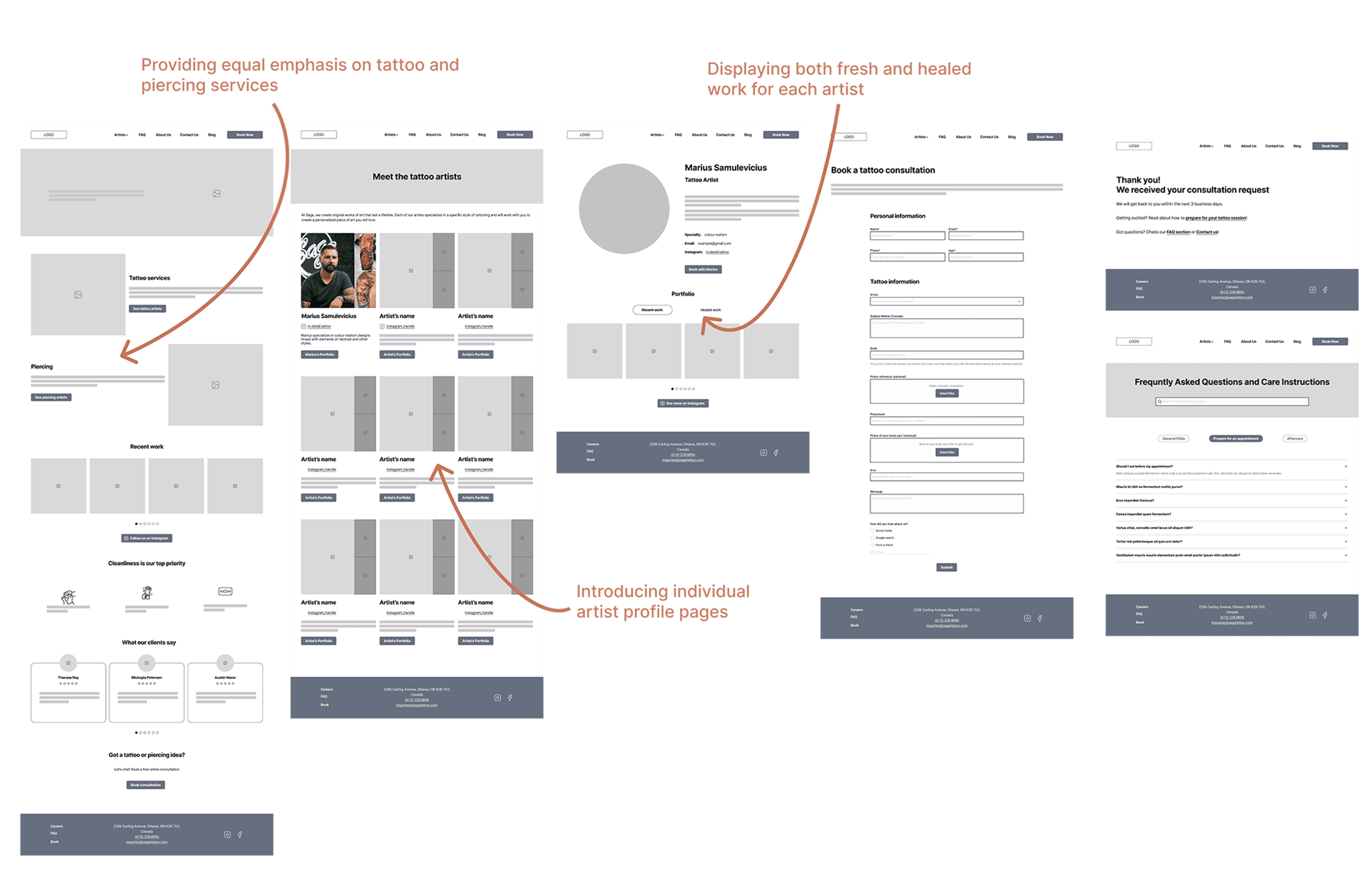
Highlighting both piercing and tattoos on the home page and in the navigation menu.
Highlighting the studio's hygiene procedures.
A separate page for each artist that includes their bio, their areas of expertise, their portfolio, pictures of healed work, and a link to their Instagram.
An FAQ page that provides information for first-time users.
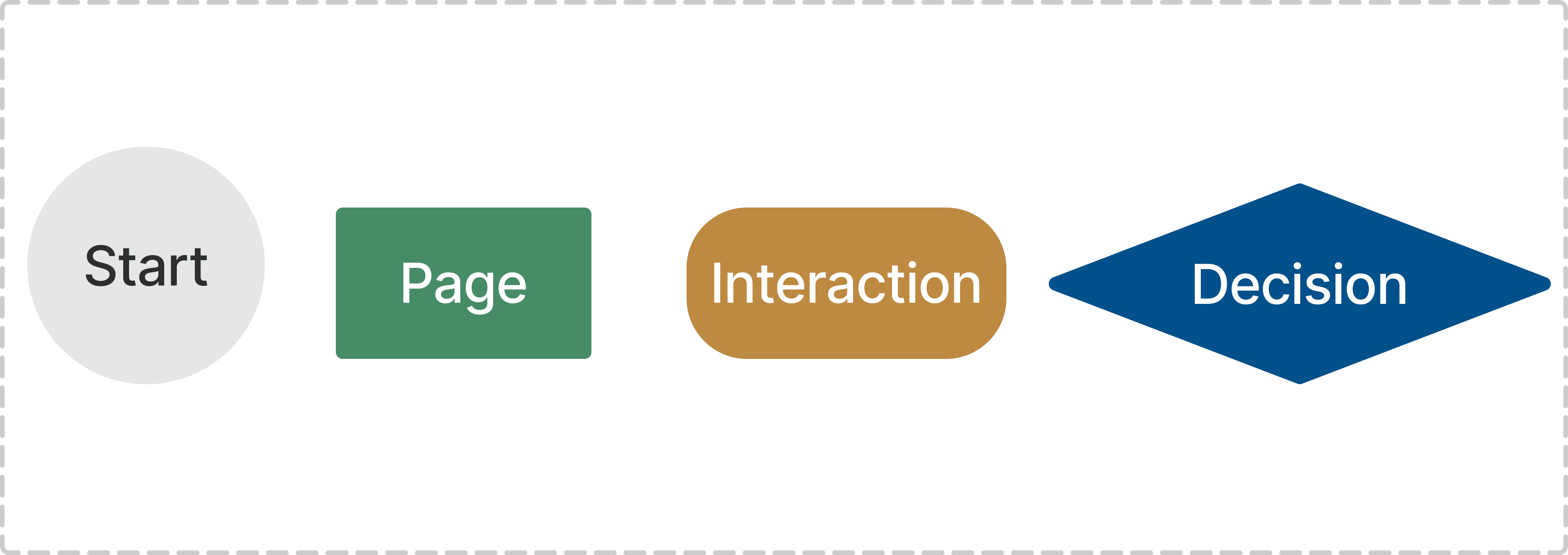
User Flow
Before I started sketching, I wanted to map out the desired flows for the most problematic areas on the website. This helped me narrow down my tasks and provide the client with a timeline for the remainder of the project.
INTERACTION DESIGN
Informational Architecture
Before jumping into designing interactions, I wanted to improve the website's information architecture. I discovered a few major issues with the existing website structure:
The website had an imbalance between tattoos and piercings. The navigation mentioned piercings, but not tattoos. However, the website includes a section called "Our Team", which highlights only tattoo artists. This inconsistency could confuse potential users about the services provided.
The booking form appears in multiple places on the website. It may seem like these are different forms used for different purposes, but in reality, they are all the same.
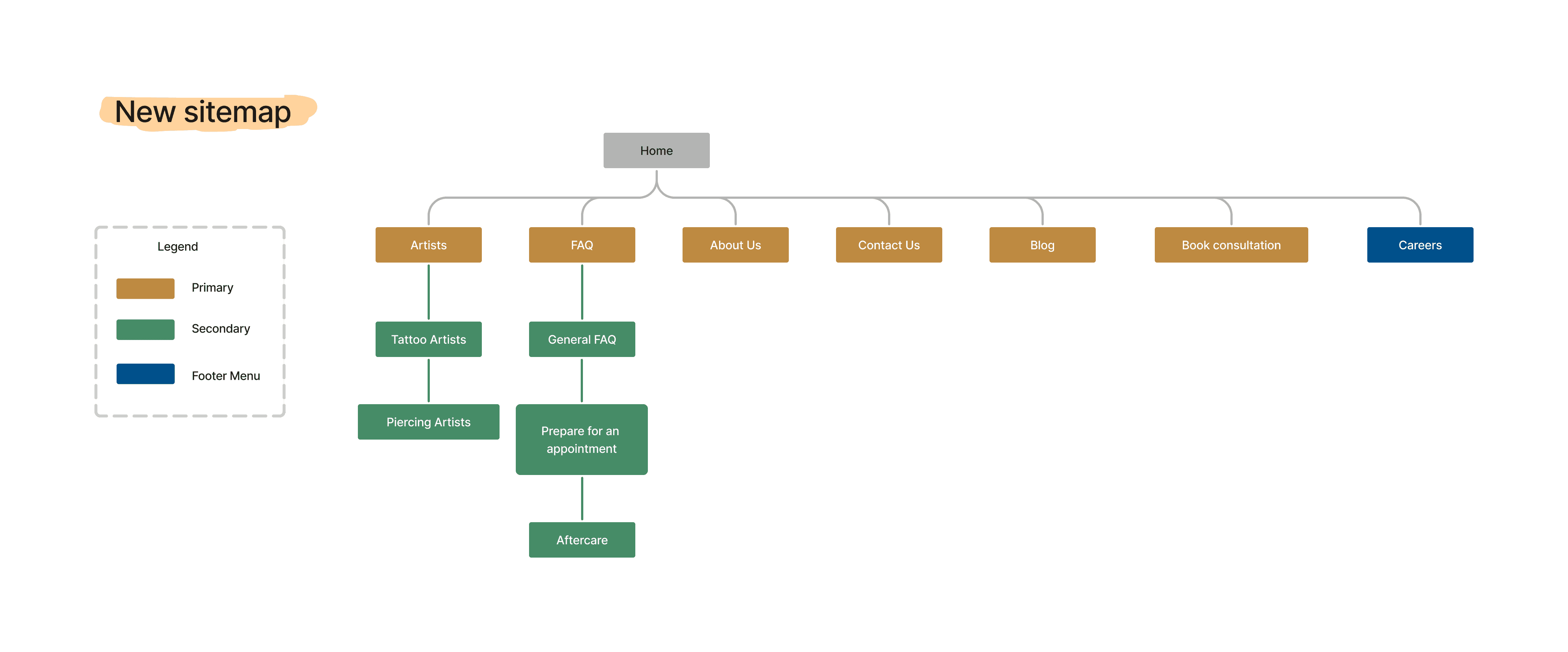
I took the opportunity to revamp the entire sitemap, making it easier to discover important features. I created a few dropdown menus for navigation, which nest relevant information.
To validate my proposed sitemap, I conducted a tree testing exercise with 15 users. I was delighted to find that the majority of users were able to easily find the requested information. However, the only major issue was that users had difficulty finding the hygiene procedures. This was a crucial aspect for 92% of users when choosing a salon.
To address this, I have decided to move the hygiene procedures to the home page while also keeping them in the FAQ section.
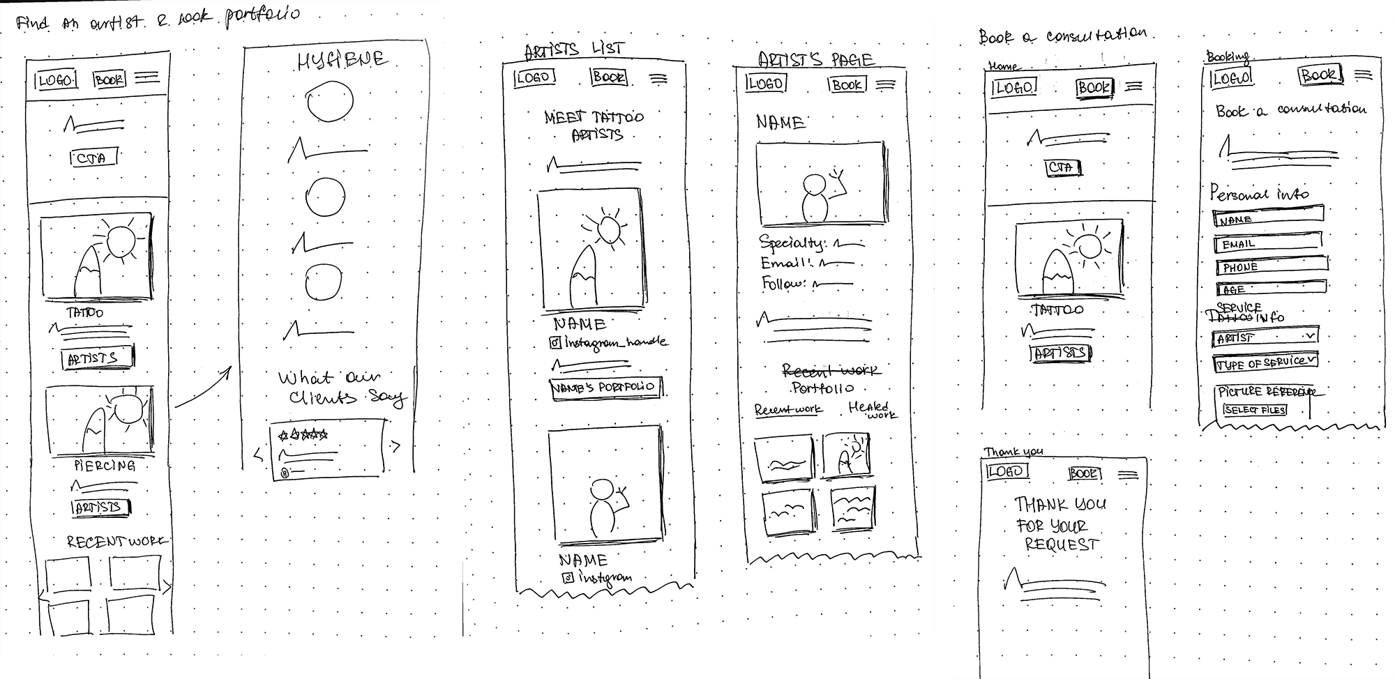
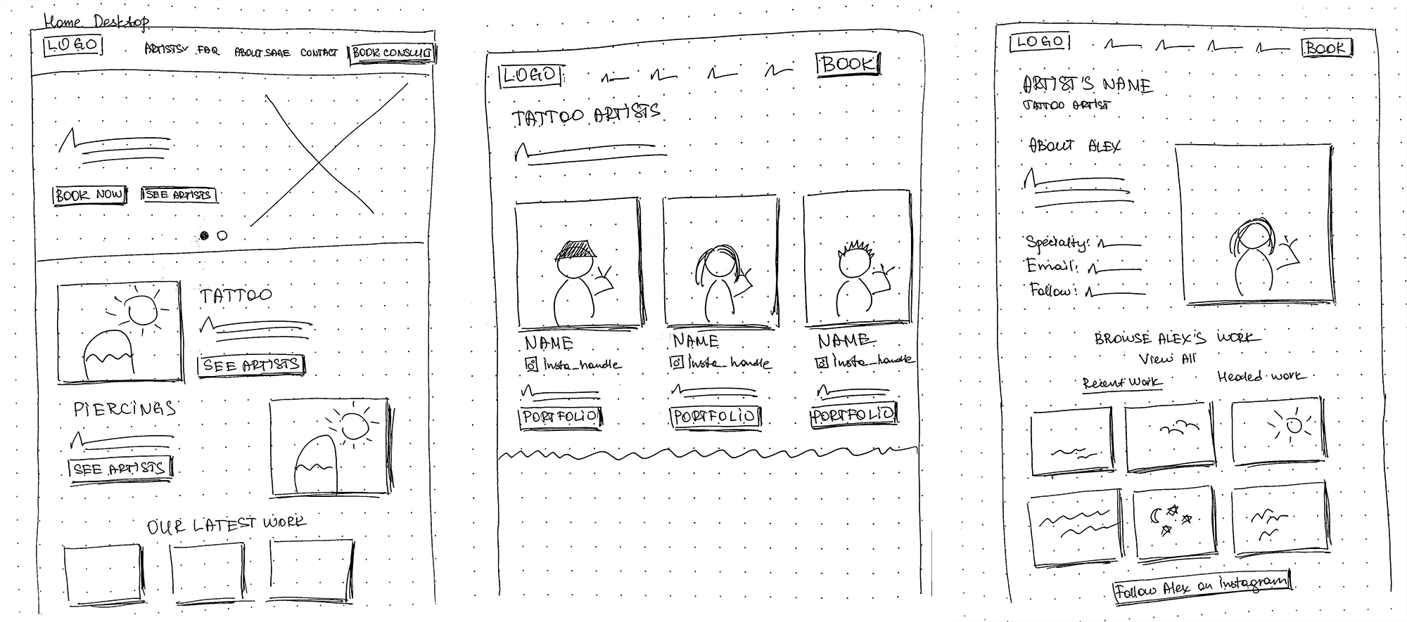
Sketches
As I had my site map ready, it was time to sketch out some possible design solutions. Sketching the user journey in this way helped me identify which pages we can reuse from the current website, and what needs to be created from scratch.
mobile viewport
Desktop viewport
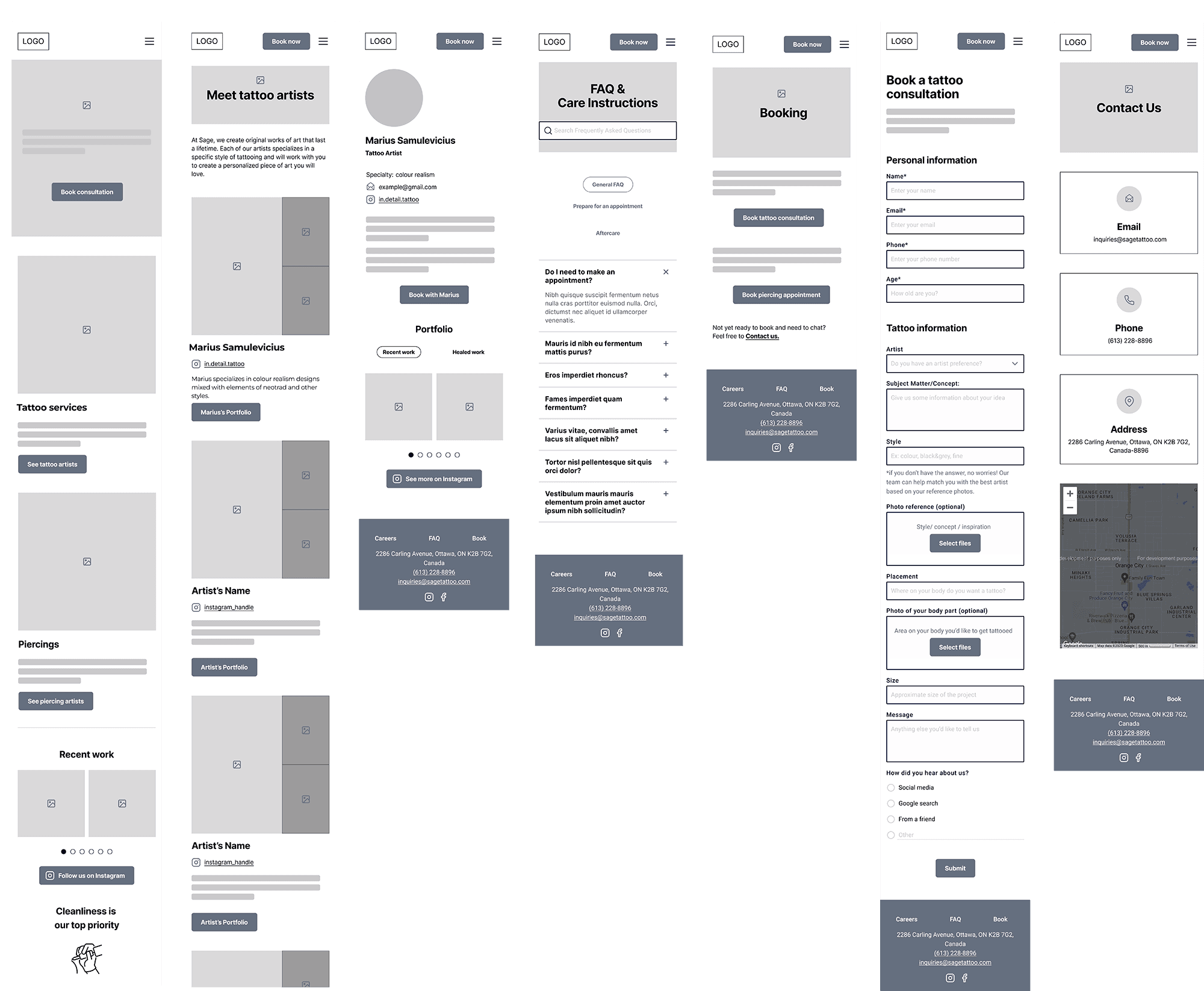
Mid-fidelity prototypes
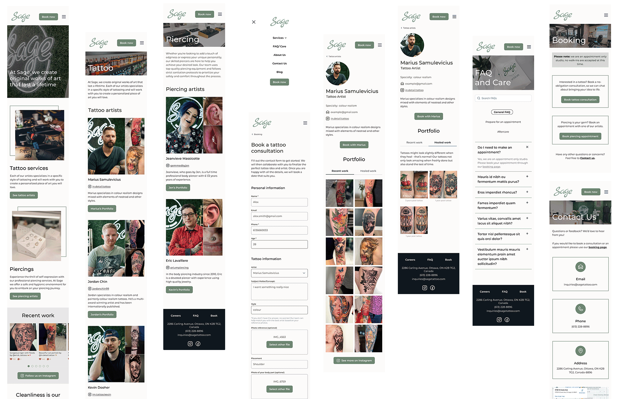
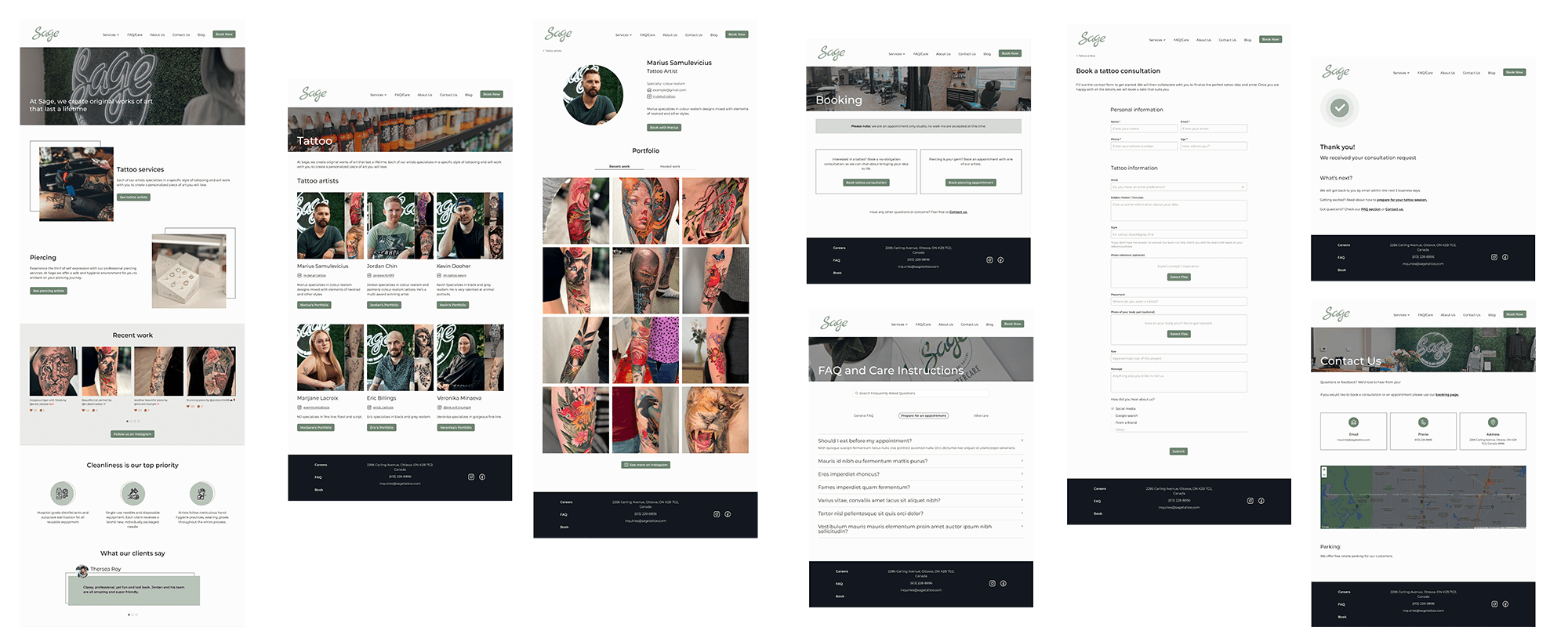
Armed with a solid understanding of the required pages for my two task flows—finding an artist and booking an appointment—I felt prepared to develop swift mid-fidelity prototypes to present to the client. As the majority of traffic comes from Instagram, I followed a mobile-first approach to optimize the mobile experience.
mobile viewport
Desktop viewport
Client's Feedback
I shared the designs with the client to gather their input before increasing their fidelity. The client had two concerns for me to address:
Placing piercing under "Artists" in the navigation could be confusing for some people who do not consider it to be an art. To avoid this confusion, I suggest renaming the navigation item to "Services" instead of "Artists".
The "Contact Us" page was created to allow customers to chat about their tattoo before they are ready to book. However, the client was concerned that their inbox would overflow, so we decided to emphasize the tattoo intake form for any questions or concerns customers may have.
UI DESIGN
Branding
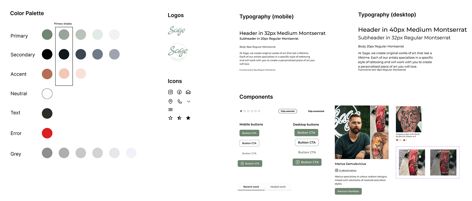
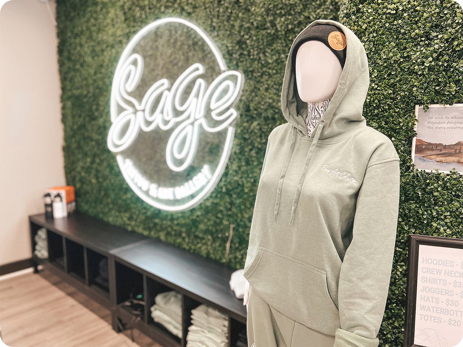
Sage Tattoo is highly committed to its branding and logo. The client has requested that the color palette, logo, and light colour scheme be preserved during the website redesign. However, they did not provide a thorough UI kit for use. The only available assets were the limited color palette and a logo file.
The branding artifacts provided by the client
I took over from here and created a detailed UI Kit for future use. I expanded the color palette, selected typography and icons, and developed website components.
Accessibility Note
The sage-green colour that the business previously used failed accessibility tests. To address this, I slightly shifted their primary colour to ensure at least an AA rating on accessibility tests. The client accepted this change following my recommendation.
Previously used sage colour didn’t pass accessibility testing
The revised version of the sage green colour passes the accessibility test
Translating the vibe
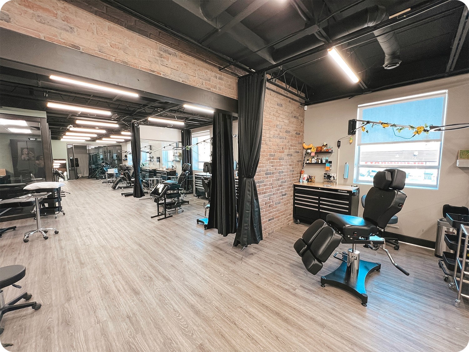
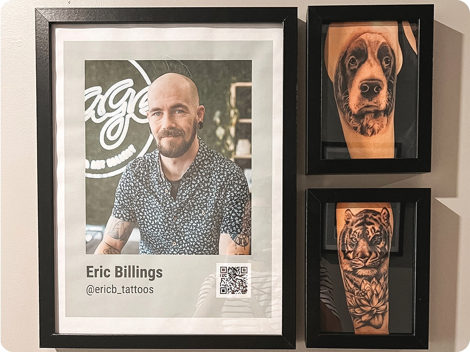
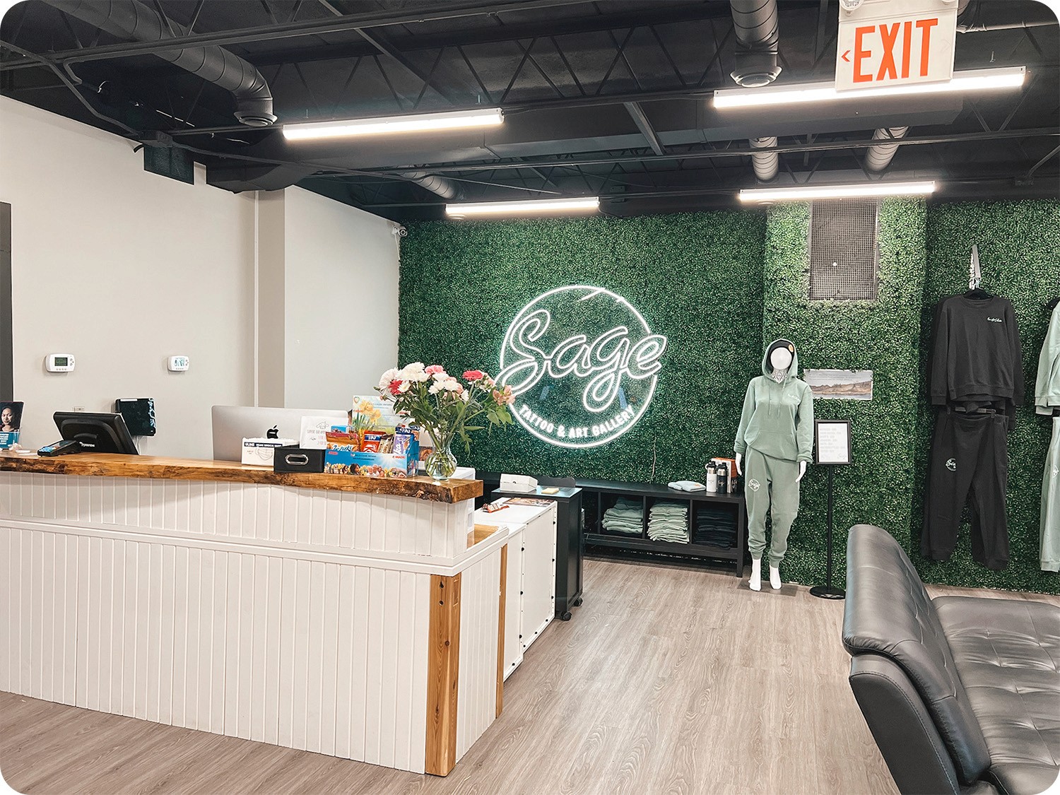
To incorporate Sage's values into the website, I visited the salon several times to experience the atmosphere and observe the staff's behaviour. The team creates a welcoming and warm environment, which I considered when deciding on the website branding. I also reused some of the design elements found at the studio, such as headshots of the artists paired with examples of their work on the right. I used this same design pattern on the website to create a cohesive online and offline experience.
Hi-fidelity wireframes
With the branding ready, it was time to put everything together into a high-fidelity prototype.
Mobile viewport
Desktop viewport
ITERATIONS
Usability Testing
Having my responsive prototype up and running, it was time to validate and test the product, and make any necessary revisions.
Moderated testing
Participants: 4
Participant screener: have either received a tattoo in the past year or are actively searching for an artist.
Platform: Google Hangouts
What went well?
This list was shared with the client to indicate that these features are valued by users.
Showcasing both fresh and healed work. All users clicked on “Healed work” tab and commented on its usefulness in their decision-making.
Link an Instagram account on the Home page. All users mentioned they found it useful to glance through the recent work before digging deeper into artists.
Keep the address and the contact information in the footer. This is where 100% of users checked when asked to look up the studio’s address.
What needs improvement?
There were a few hiccups users experienced as they completed the tasks.
Artist's portfolio is not discoverable
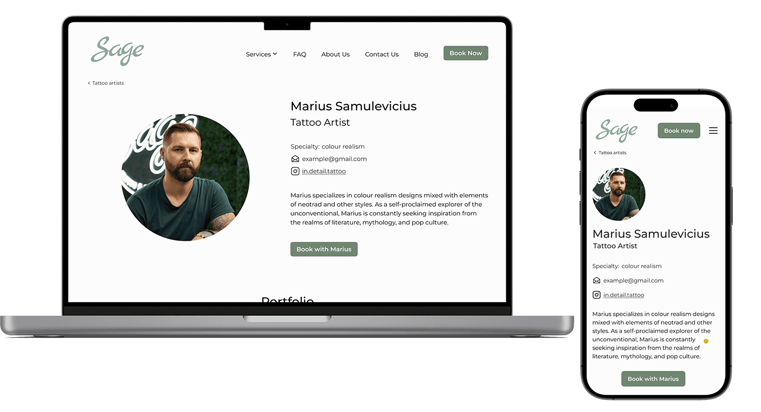
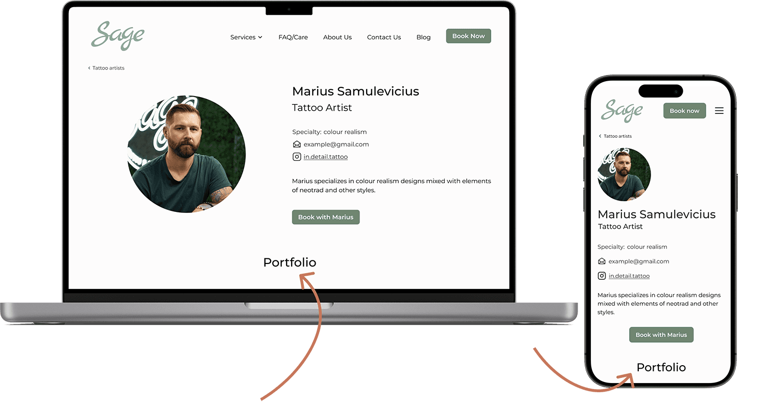
Some users did not notice that the artist's portfolio was located below their bio, potentially causing them to miss it. To address this I decided to shrink the upper section of the page to display the Portfolio title on most viewports.
Before
On many viewports the Portfolio section would be cut out
After
A Portfolio header is visible on most viewports
Portfolio pictures don't deliver enough info
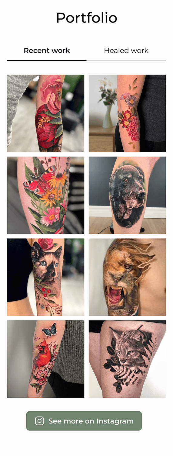
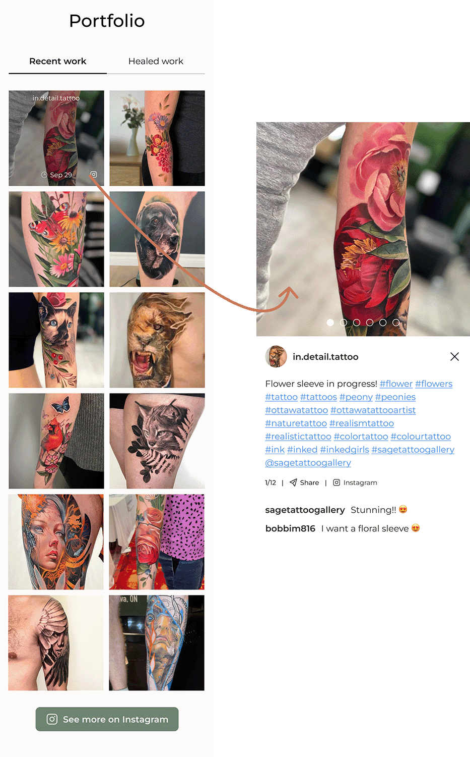
Users wanted more flexibility when browsing through portfolio pictures. They called out the inconvenience of going to Instagram before they are sure they like the artist. I’ve added more images to the portfolio to prevent users from a need to go to Instagram prematurely. I also added an option to expend an image.
Before
Eight pictures shown per portfolio.
No option to zoom in
After
Twelve pictures shown per portfolio.
Every image can be enlarged
Unclear expectations after filling out the form
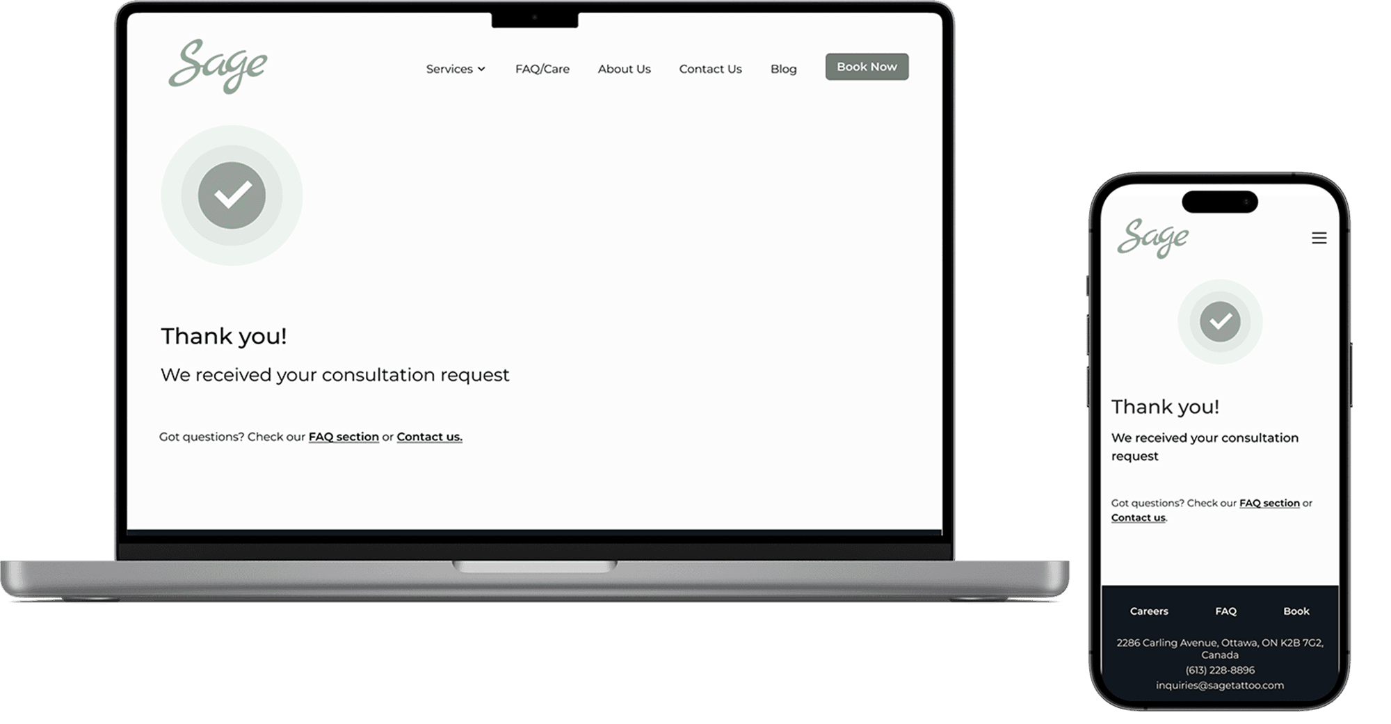
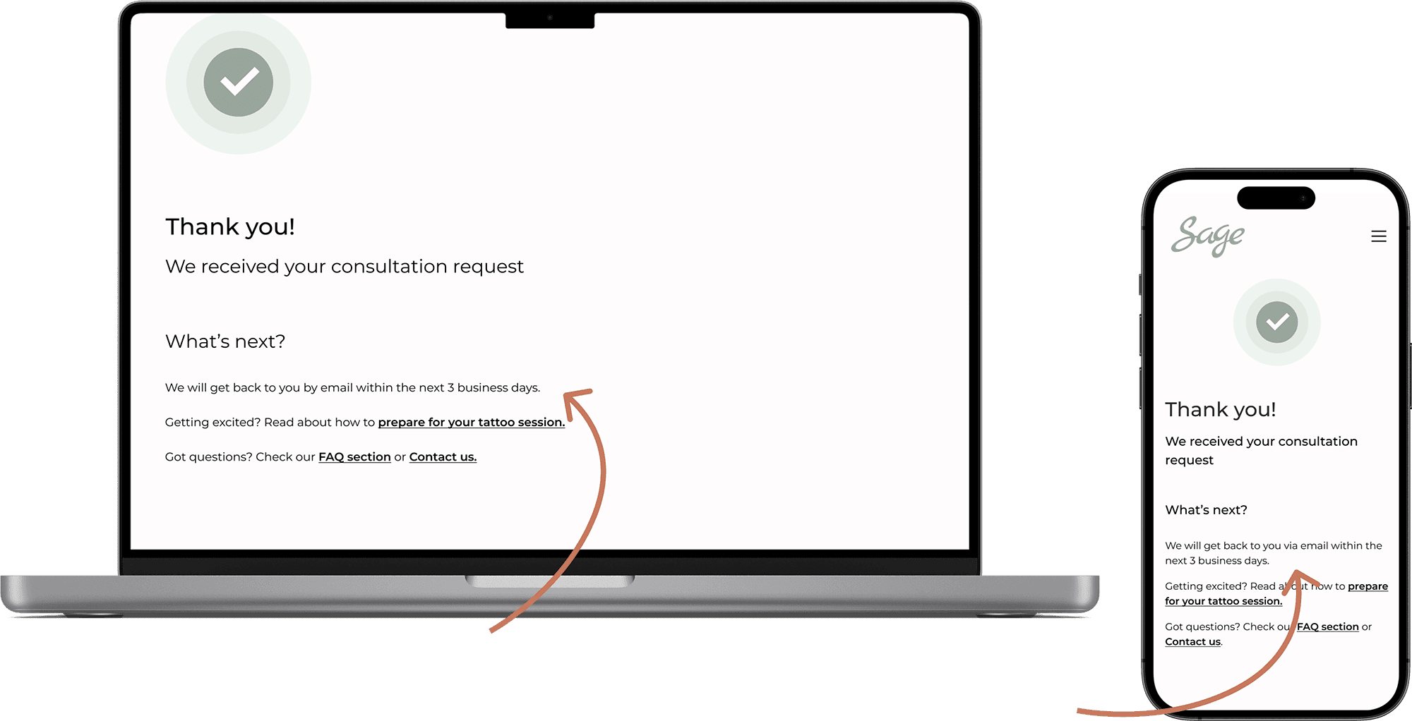
Some users expected a phone consultation after completing the intake form, but the salon actually follows up via email without formally setting up a consultation. I reworked the copy on both the booking and thank-you pages to set the right expectations.
Before
Thank you page doesn't provide information on the next steps
After
Thank you page features the "What's next" section
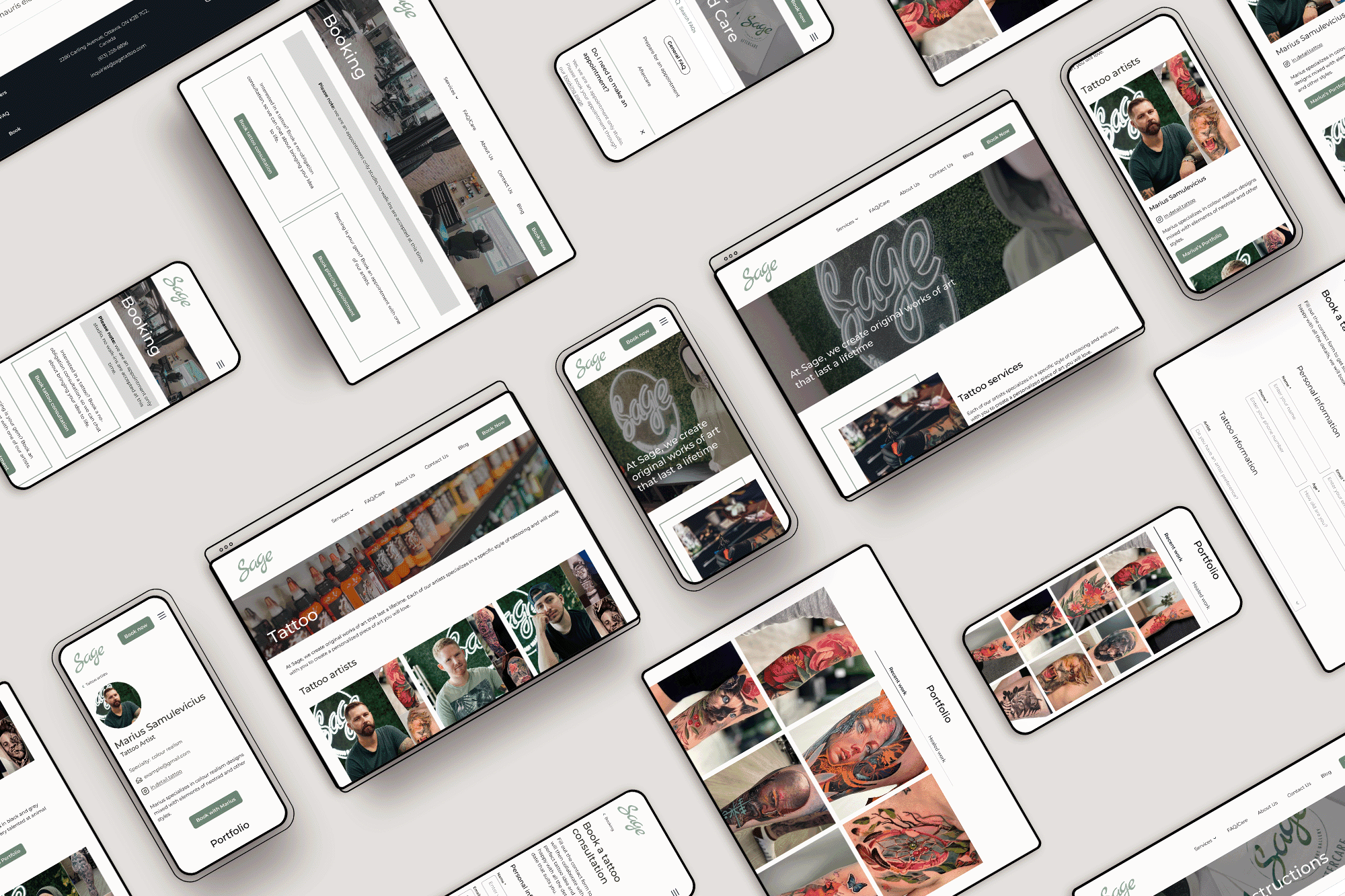
FINAL DESIGNS
LEARNINGS AND SUCCESS METRICS
Learnings
One of the biggest challenges in this project was the absence of analytics from the client. To address this, I conducted more thorough research, but this made me short on time for user testing.
If I had more time, I would have tested the website with Sage's actual past customers. However, this project has also taught me to let go of perfectionism whenever possible in order to deliver a minimum viable product (MVP) to a client in a timely manner.
Balancing the needs of users and clients can be challenging. In my case, I had to convince a client to change their primary brand colour for the sake of accessibility. I also had to adjust their logo to make it more user-friendly on smaller screens.
Success Metrics
Unfortunately, the client's budget changed during the project, and the team had to postpone the website build until 2024. However, we continued to work with Sage's management to evaluate the design against our initial success metrics.
Problem
The team had difficulty keeping the website up-to-date and needed a solution that would run a website almost on an auto-pilot.
Solution
The proposed design incorporates artists' Instagram feeds on their profile pages. This allows the content to be automatically updated with new posts.
Client sentiment:
Sage’s manager estimates that this alone would reduce her daily workload by 10-15%.
Problem
The team was unhappy with not being able to showcase their talents on their website and relying solely on Instagram for customers to find their artists.
Solution
The website now includes artist profiles, which can be customized with their bios, pictures, and an evergreen portfolio feed.
To wrap up this project, I prepared handoff artifacts for the developer to use in Q1 2024. These included not only my designs but also photography, WordPress templates, and plugin recommendations.
my other work
